To make the Flexbox work on all the web browsers, use the min-width and max-width equivalents of flex. For example, for this − min-width: 40%; max-width: 40%; Use the CSS Shorthand Property. It states flex-grow | flex-shrink | flex-basis as shown in...
To make the Flexbox work on all the web browsers, use the min-width and max-width equivalents of flex. For example, for this −
min-width: 40%;
max-width: 40%;
Use the CSS Shorthand Property. It states flex-grow | flex-shrink | flex-basis as shown in the below syntax −
flex: flex-grow flex-shrink flex-basis|auto;
For the above, we can set the Flex as −
flex: 0 0 40%;
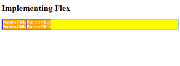
Let us now see a Flexbox example that works on all the web browsers. We h**e two divs inside our parent div parentBox −
The style for the parent container. We h**e use the CSS Flex shorthand property −
For the Child i.e. childBox, we h**e again used the shorthand property to set the flexible length on flexible items −
The nested child in the above .childBox is set with Flex. This and the above nests the flex containers −
Here’s the complete example −
